
Cadasio handles different screen sizes using devices, which are additional sets of properties that only come into effect when viewing at certain screen widths. Check out our devices blog for more information on these.
As part of devices though, you need to consider how you want your 2D markup to behave at different screen sizes. Cadasio can define sizes and positions using either a percentage of the screen width or using pixels.
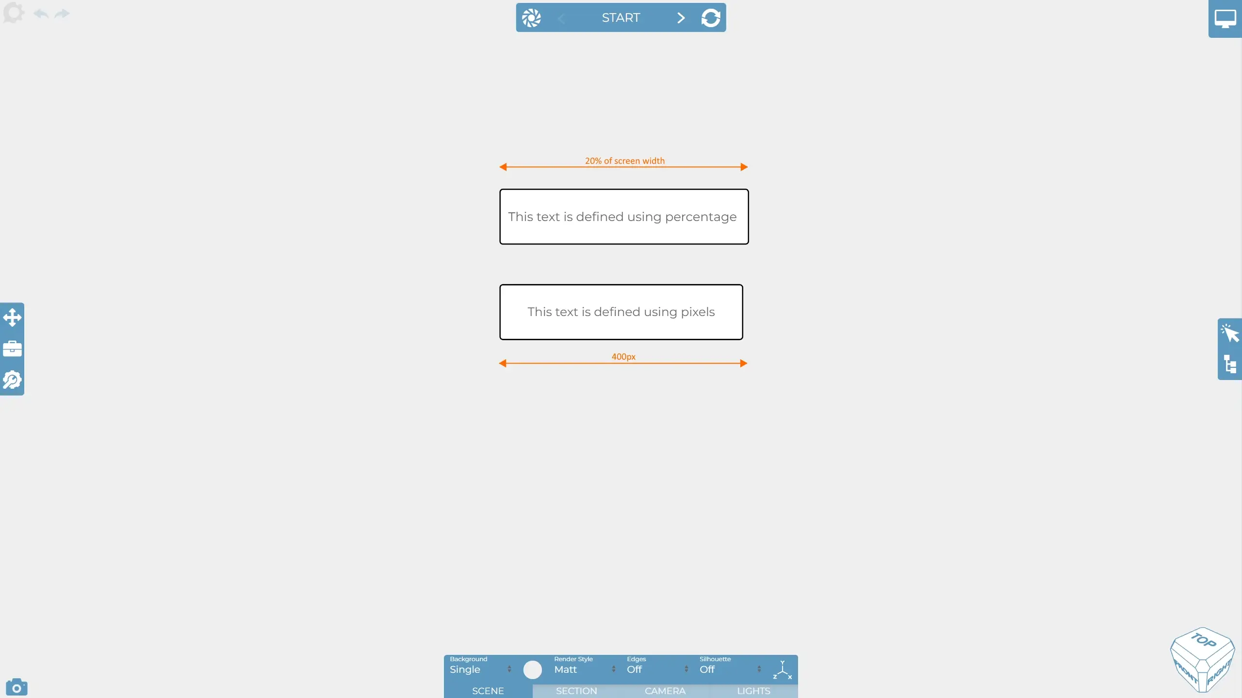
Lets take the above example, as you can see we have two pieces of text. The size of one is defined using percentages, the other pixels. You are able to tell what units an item is using by selecting it, then going to the size tab on the property bar. You will see either "PX" for pixels or "%" for percentages.
Let’s change to a smaller device.
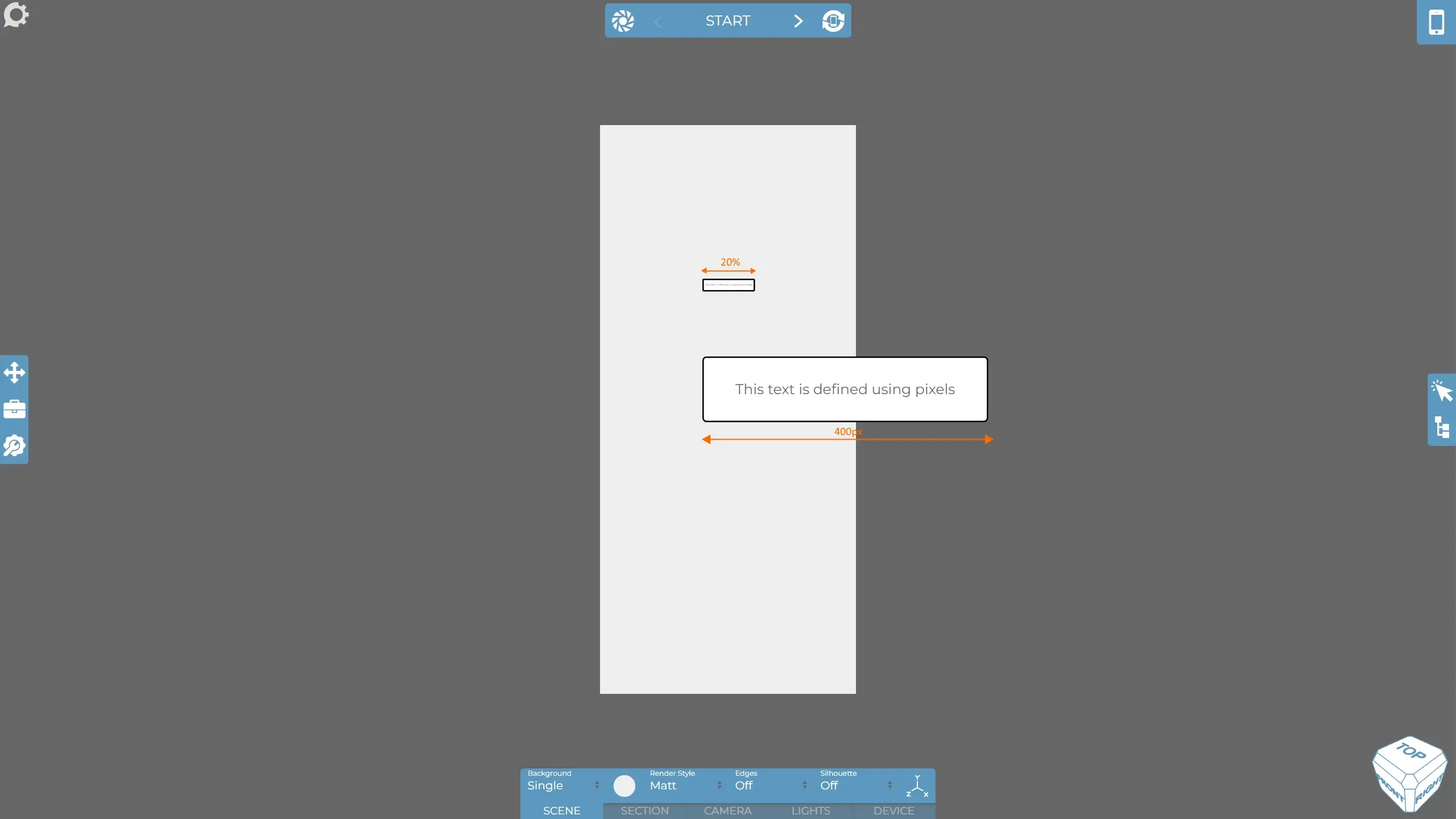
Notice that the percentage based text has become challenging to read because whilst it is staying the same percentage of the screen, the screen width has become significantly smaller, where as the pixel sized markup remains the same.
Whilst it may make sense to use smaller text on a smaller device, generally most people would not want the text to become so small automatically, and instead opt to choose to change the text size themselves if appropriate, typically this is done using the device scale. Therefore, by default text based items in the Cadasio default toolbox are all pixel based as this generally gives the best result out of the box. This has changed from when Cadasio was initially released so you may find you get a message asking you to update your toolbox definitions (see below). You may also find our fonts blog of more interest when it comes to sizing your text.
Lets take a look at another example, this time using pictures.
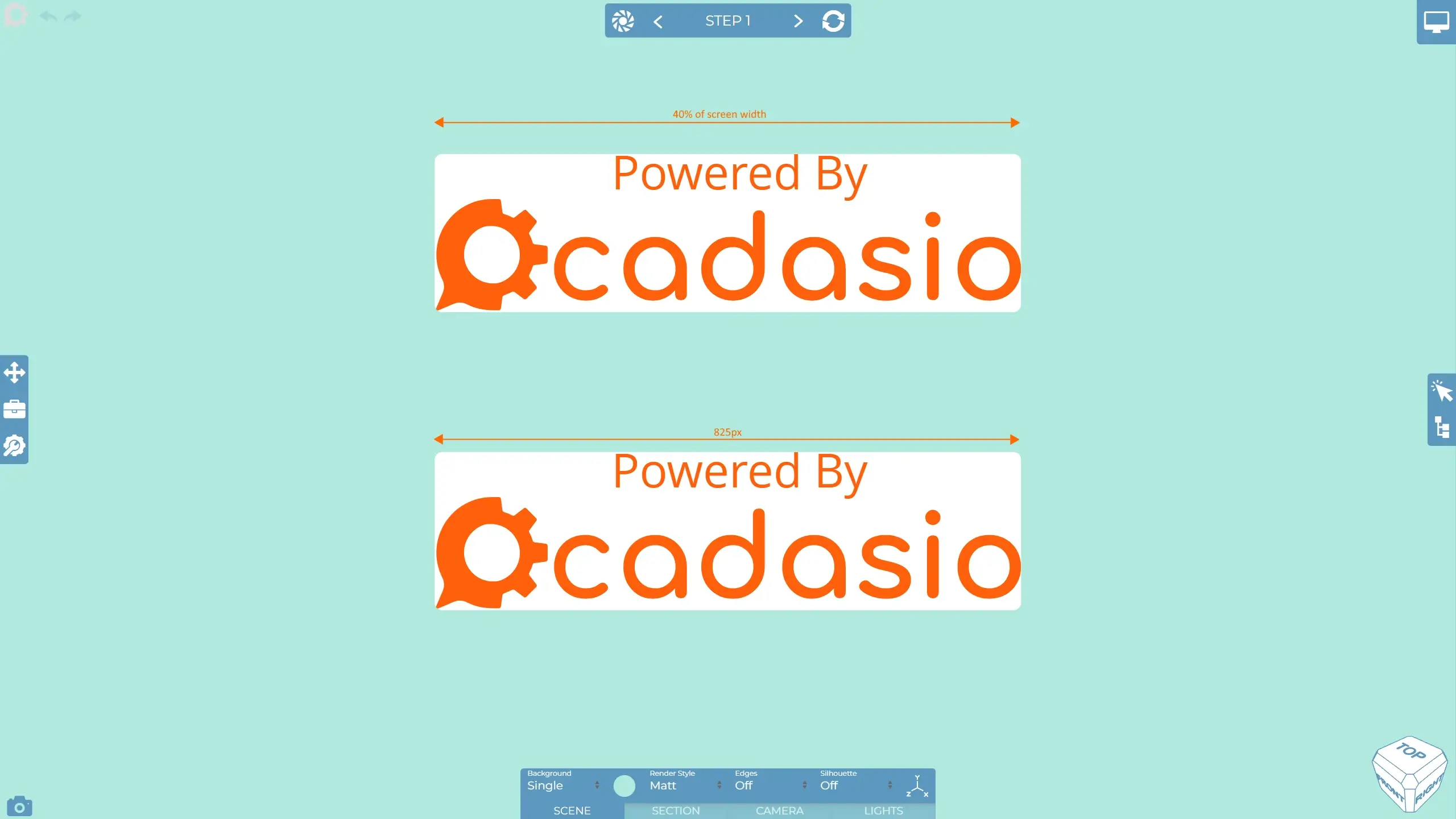
As with the text we have one that is defined using pixels and the other using pixels. When we change to a smaller device you can see we get the same behaviour as with the text...
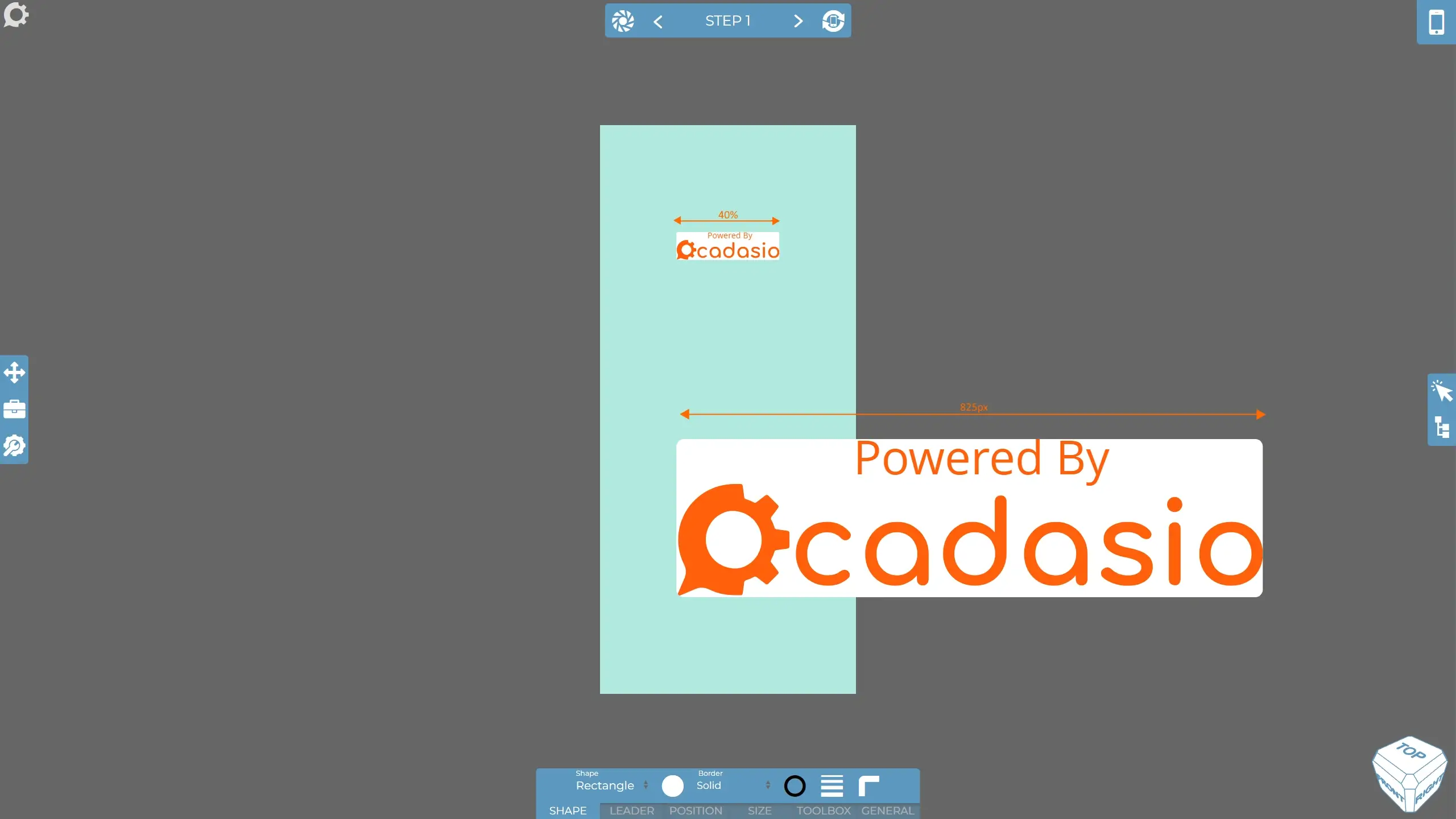
With pictures, however, it is much more likely that you would want it to scale down automatically for smaller screen sizes. That is why pictures are percentage based within the default toolbox.
It is worth noting that the position of elements can also be defined using percentages and pixels, which will affect how things fit between devices. We typically find that percentage is the much more common desired behaviour though as this will mean items sit relatively in the correct position no matter the screen size.
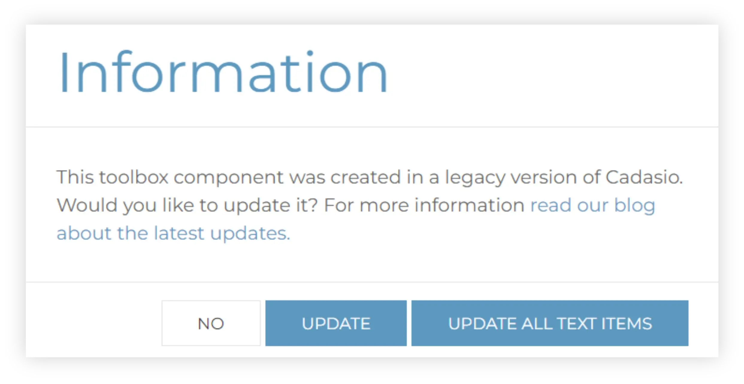
If you have created your own toolbox definitions, or have been a Cadasio customer for a long time, you may want to check how your toolbox items are defined and update them where necessary. You can do this by selecting it and checking out the size tab on the property bar. We generally recommend that you have elements that contain text to be defined using pixels so that they naturally look better on devices with minimal effort. Depending on the age of your toolbox, you may see the above message when adding text based items, clicking update will change them to be using pixels for the size to save you doing it.
If you want to start fresh, then don’t forget you can always import the default toolbox again, so you know you have got the recommend setup.


